HTML Table Sizes: Controlling Dimensions
Posted 2024-09-06 01:29:20
0
11K

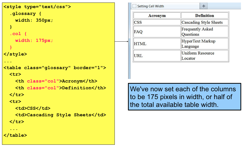
HTML tables can be sized using the width and height attributes, which specify the dimensions of the table in pixels, percentages, or relative units like em or rem.
Setting Table Width
- Pixels:
HTML
<table width="400"> </table> - Percentages:
HTML
<table width="80%"> </table> - Relative Units:
HTML
<table width="20em">
  </table>
Setting Table Height
- Pixels:
HTML
<table height="300"> </table> - Percentages:
- Relative Units:
HTML
<table height="15em">
  </table>
Example with Different Sizes
HTML
<table>
  <tr>
    <th>Product</th>
    <th>Price</th>
  </tr>
  <tr>
    <td>Product A</td>
    <td>$100</td>
  </tr>
  <tr>
    <td>Product B</td>
    <td>$200</td>
  </tr>
</table>

<table width="300" height="200">
  <tr>
    <th>Product</th>
    <th>Price</th>
  </tr>
  <tr>
    <td>Product A</td>
    <td>$100</td>
  </tr>
  <tr>
    <td>Product B</td>
    <td>$200</td>
  </tr>
</table>
Important Notes
- Responsive Design: For tables to adapt to different screen sizes, consider using percentages or relative units instead of fixed pixel values.
- Overflow: If the content within a table cell exceeds the specified dimensions, it might overflow or be clipped. Use CSS properties like
overflow-xandoverflow-yto handle this. - Table Layout: The
table-layoutproperty can affect how the table is rendered. The default value isauto, which means the table layout is determined by the content. You can also usefixedto specify a fixed table layout, which can improve performance in certain scenarios.
By effectively using the width and height attributes, you can control the dimensions of your HTML tables to fit your specific layout requirements and ensure optimal display across different devices and screen sizes.

Site içinde arama yapın
Kategoriler
- Technology
- EĞİTİM BİLGİLERİ
- Business
- Music
- Got talent
- Film
- Politics
- Food
- Oyunlar
- Gardening
- Health
- Home
- Literature
- Networking
- Other
- Party
- Religion
- Shopping
- Sports
- Theater
- Wellness
Read More
HTML Table Borders: A Closer Look
HTML table borders are used to outline the individual cells and rows within a table, making it...
String Methods
String split() and join()
It’s a common programming task is to take a large string and...
Understanding the SUMPRODUCT Function
The SUMPRODUCT function in Excel is a powerful tool used to perform array-based calculations...
Versions of the Linux Operating System
Linux is a versatile and open-source operating system kernel that serves as the foundation for a...
Class Customization and Operator Overloading
Class customization
Class customization allows you to define how a class behaves for...


