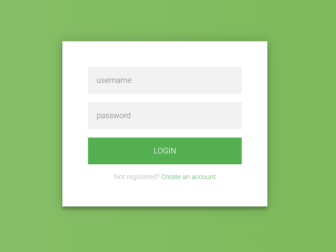
Creating a login form using HTML and CSS
Veröffentlicht 2025-01-21 01:24:55
0
10KB

Creating a login form using HTML and CSS is a fundamental skill in web development. Here's a step-by-step guide to building a simple and responsive login form:
1. HTML Structure
Begin by setting up the basic HTML structure for the login form. This includes a container for the form elements such as the username and password fields, and a submit button.
html
<!DOCTYPE html>
<html lang="en">
<head>
    <meta charset="UTF-8">
    <meta name="viewport" content="width=device-width, initial-scale=1.0">
    <title>Login Form</title>
    <link rel="stylesheet" href="styles.css">
</head>
<body>
    <div class="login-container">
        <h2>Login</h2>
        <form action="/login" method="post">
            <label for="username">Username</label>
            <input type="text" id="username" name="username" required>

            <label for="password">Password</label>
            <input type="password" id="password" name="password" required>

            <button type="submit">Login</button>
        </form>
    </div>
</body>
</html>
Explanation:
- The
<form>element wraps the input fields and the submit button. - Each
<label>is associated with an<input>field, enhancing accessibility. - The
requiredattribute ensures that users cannot submit the form without filling in these fields.
2. CSS Styling
Next, style the form to make it visually appealing and responsive.
css
/* styles.css */
body {
    display: flex;
    justify-content: center;
    align-items: center;
    height: 100vh;
    margin: 0;
    font-family: Arial, sans-serif;
    background-color: #f2f2f2;
}

.login-container {
    width: 100%;
    max-width: 400px;
    padding: 20px;
    background-color: #fff;
    box-shadow: 0 0 10px rgba(0, 0, 0, 0.1);
    border-radius: 8px;
}

h2 {
    text-align: center;
    margin-bottom: 20px;
}

label {
    display: block;
    margin-bottom: 5px;
    font-weight: bold;
}

input[type="text"],
input[type="password"] {
    width: 100%;
    padding: 10px;
    margin-bottom: 15px;
    border: 1px solid #ccc;
    border-radius: 4px;
    box-sizing: border-box;
}

button {
    width: 100%;
    padding: 10px;
    background-color: #4CAF50;
    color: white;
    border: none;
    border-radius: 4px;
    cursor: pointer;
    font-size: 16px;
}

button:hover {
    background-color: #45a049;
}
Explanation:
- The
bodyis styled to center the login form both vertically and horizontally. - The
.login-containerclass styles the form container with a fixed width, padding, background color, shadow, and rounded corners. - Input fields and the button are styled for better user experience, with padding, borders, and hover effects.
3. Responsive Design
To ensure the form is responsive on various screen sizes, the .login-container is set to a maximum width and uses percentage-based widths for its elements. This allows the form to resize appropriately on different devices.

Suche
Kategorien
- Technology
- Ausbildung
- Business
- Music
- Got talent
- Film
- Politics
- Food
- Spiele
- Gardening
- Health
- Startseite
- Literature
- Networking
- Andere
- Party
- Religion
- Shopping
- Sports
- Theater
- Wellness
Mehr lesen
Brief history of HTML
A Brief History of HTML
HTML (HyperText Markup Language) is the backbone of the World Wide Web,...
Creating a login form using HTML and CSS
Creating a login form using HTML and CSS is a fundamental skill in web development. Here's a...
UACE WAKISSHA FOODS AND NUTRITION 2024
UACE WAKISSHA FOODS AND NUTRITION 2024
Understanding Brute Force Attacks
A brute force attack is a method used by attackers to gain unauthorized access to a system,...
Range and Nested Loops
Range Function (range())
The range() function is a built-in function in Python used to generate...


