Creating a login form using HTML and CSS
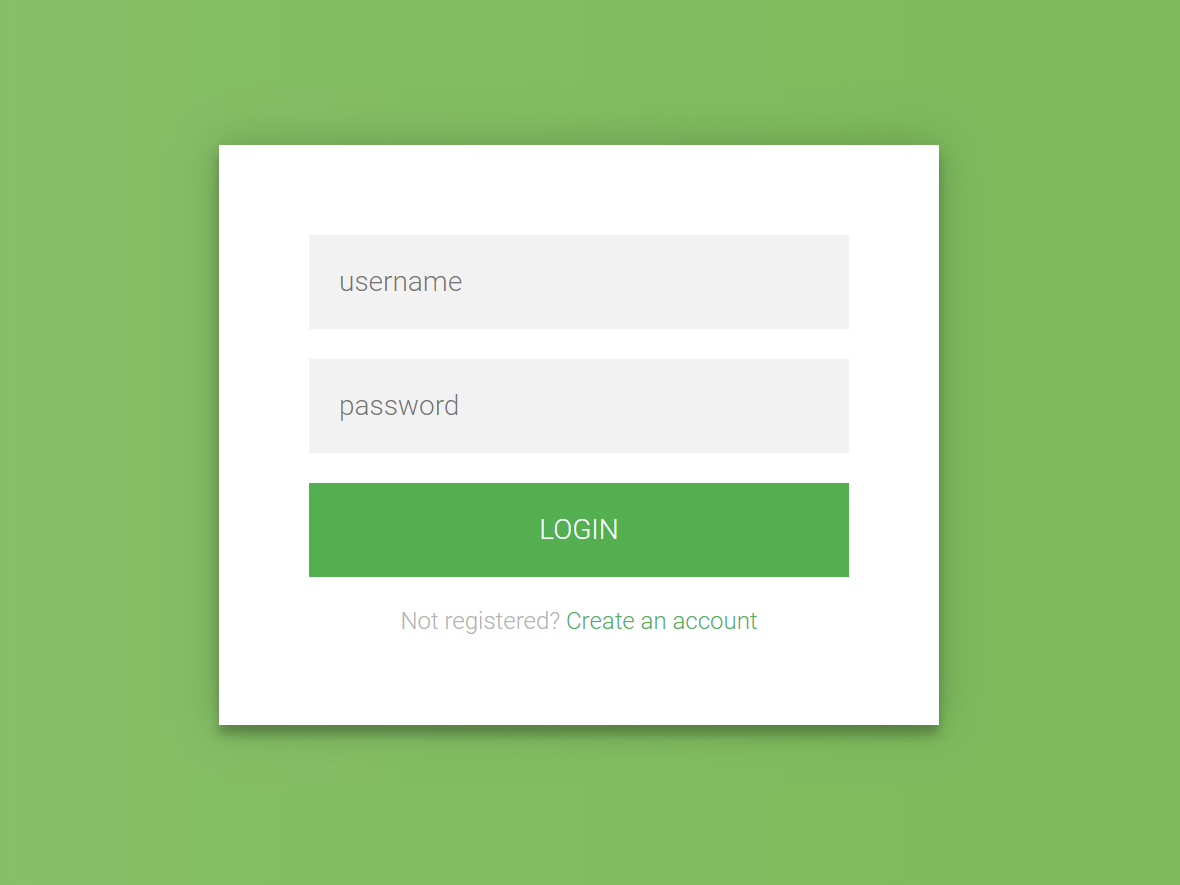
Creating a login form using HTML and CSS is a fundamental skill in web development. Here's a step-by-step guide to building a simple and responsive login form:
1. HTML Structure
Begin by setting up the basic HTML structure for the login form. This includes a container for the form elements such as the username and password fields, and a submit button.
html
<!DOCTYPE html>
<html lang="en">
<head>
<meta charset="UTF-8">
<meta name="viewport" content="width=device-width, initial-scale=1.0">
<title>Login Form</title>
<link rel="stylesheet" href="styles.css">
</head>
<body>
<div class="login-container">
<h2>Login</h2>
<form action="/login" method="post">
<label for="username">Username</label>
<input type="text" id="username" name="username" required>
<label for="password">Password</label>
<input type="password" id="password" name="password" required>
<button type="submit">Login</button>
</form>
</div>
</body>
</html>
Explanation:
- The
<form>
element wraps the input fields and the submit button. - Each
<label>
is associated with an<input>
field, enhancing accessibility. - The
required
attribute ensures that users cannot submit the form without filling in these fields.
2. CSS Styling
Next, style the form to make it visually appealing and responsive.
css
/* styles.css */
body {
display: flex;
justify-content: center;
align-items: center;
height: 100vh;
margin: 0;
font-family: Arial, sans-serif;
background-color: #f2f2f2;
}
.login-container {
width: 100%;
max-width: 400px;
padding: 20px;
background-color: #fff;
box-shadow: 0 0 10px rgba(0, 0, 0, 0.1);
border-radius: 8px;
}
h2 {
text-align: center;
margin-bottom: 20px;
}
label {
display: block;
margin-bottom: 5px;
font-weight: bold;
}
input[type="text"],
input[type="password"] {
width: 100%;
padding: 10px;
margin-bottom: 15px;
border: 1px solid #ccc;
border-radius: 4px;
box-sizing: border-box;
}
button {
width: 100%;
padding: 10px;
background-color: #4CAF50;
color: white;
border: none;
border-radius: 4px;
cursor: pointer;
font-size: 16px;
}
button:hover {
background-color: #45a049;
}
Explanation:
- The
body
is styled to center the login form both vertically and horizontally. - The
.login-container
class styles the form container with a fixed width, padding, background color, shadow, and rounded corners. - Input fields and the button are styled for better user experience, with padding, borders, and hover effects.
3. Responsive Design
To ensure the form is responsive on various screen sizes, the .login-container
is set to a maximum width and uses percentage-based widths for its elements. This allows the form to resize appropriately on different devices.
Rechercher
Catégories
- Technology
- Éducation
- Business
- Music
- Got talent
- Film
- Politics
- Food
- Jeux
- Gardening
- Health
- Domicile
- Literature
- Networking
- Autre
- Party
- Religion
- Shopping
- Sports
- Theater
- Wellness
Lire la suite
Basic structure of an HTML document
An HTML document is composed of two main sections: the head and the body.
The <head>...
BASIC COMPUTER NETWORK
A computer network is a collection of interconnected devices, such as computers, servers, and...
String Methods
String split() and join()
It’s a common programming task is to take a large string and...
Bold Text in HTML
To make text bold in HTML, you can use either the <b> or <strong> element. Both...
Comparing Data Types and Conditional Expressions
Comparing Data Types:
In Python, you can compare data types using the type() function. This...